Have you ever wondered what it would be like to work with a professional designer to pull together a room? I definitely have but I’ve just never had the budget. Fortunately for all of us, there’s a whole new breed of designer these days. People like Janette, who have style in spades and are all set up to work with you remotely and on a budget.
I was introduced to Janette Crawford after she attended my talk at the Alt conference last year and when she said she’d love to help me out with a room in the new house I jumped at the chance.
Janette founded Sun + Dotter, a personal shopping & styling service for design-conscious parents. She works with moms on everything from maternity styling to nursery design. The thing I love most about her services is the flexibility she offers in working within your budget and project scope (both big and small)… And of course her sense of style (check out her daughter’s gorgeous nursery featured on her home page!).
For me, she helped tackle the family room with her signature baby-friendly styling. It was the kind of project I always wondered if it was possible to get a pro to help me with – I wanted assistance with specific areas of the room but also had some major pieces, like our couch, that needed to be worked around. So it wasn’t a complete room design, more like some serious help from a pro in exactly the areas I needed.
For more of Janette’s home and fashion tips for parents, be sure to join (it’s one of my favorite things to hit my inbox these days).
And now that introductions are complete, I’m handing things over to Janette to share her two favorite tips for establishing a finished and cohesive design in any room…
I love Steph’s perspective on her home. The house is “forever” and, in time, all her furnishings will be too. But right now she has little kids and a modest budget. (Sounds familiar!)
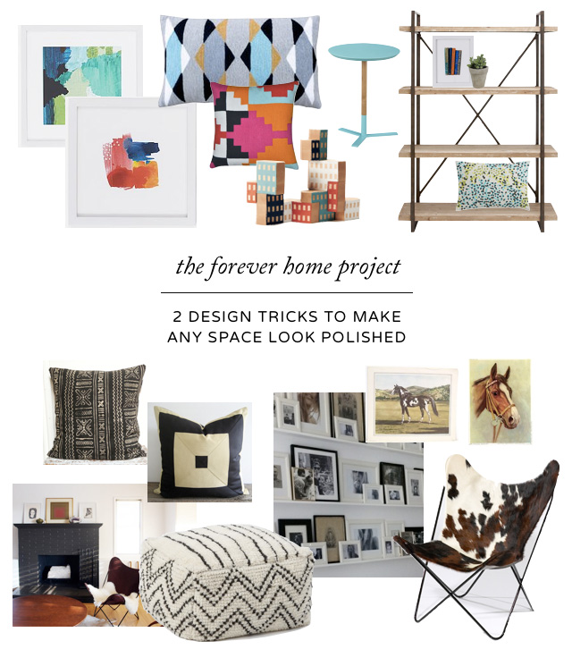
I worked with Steph to design a kid-friendly Forever Family Room, where the main objective was to cost-effectively make the room feel pulled-together. We tried out two design tricks that I think anyone can use to give their space a pulled-together look. In mood-board form, here’s how it turned out — but first, how it started.

Before: Beige, Beige, and more Biege
Steph’s needs for the room were to fill the wall around the TV, add extra seating for guests and incorporate storage for kids’ books and baby toys. She wanted to include plants, and to use art other than family photos.
Her favorite feature of the room was the fireplace, especially for Christmas stockings… and her least favorite feature was the fireplace, because it’s so big and traditional. After these photos were taken, she had ivory carpet installed.
This first design trick is one of my favorites.

Design Trick #1: Design with, not around, a room’s existing colors
The idea here is to take the bones of your room and design with them, rather than trying to design around them. So many of the rooms that we adore on Pinterest don’t have the wood trim/wood floors/carpet that our real-world homes have. But that doesn’t mean we have to miss out on all the fun!
To take this direction with Steph’s family room, I started with the ivory walls, beige sectional and honey-brown wood that were established in the room. I wanted to add some major contrast, so I added black, white and dark brown to the palette.
I really wanted to address the love-hate feelings toward the fireplace, so in this design it’s painted black. (It’s great to have a bold focal point like that in any TV room, to keep the TV from being the star.) Textiles like mudcloth, cowhide and shearling create lots of texture. And vintage horse prints from eBay speak to Steph’s “modern farmhouse” inspiration and the barn behind the house.
Despite loving this overall look, Steph and her family were looking for a more colorful palette and a more playful vibe. So onto the next trick…

Design Trick #2: In an eclectic room, create cohesion by repeating several themes
If sticking to a restricted color palette isn’t for you, then by all means, go all out with color and pattern! But you still want an air of cohesion among everything. So pick one or more of the most stand-out motifs in the room and repeat them. The goal is not to be matchy, but complementary. You’ll find that patterns emerge when you’re not even trying — but it’s often when you intentionally add a few finishing repetitions that a room hits a home run.
Steph loves color. So for the family room, to contrast off the room’s beige and ivory, I focused on rich, saturated colors. Two other themes that up the modern ante are geometric patterns and abstract artwork.
Wall art will play a major role in bringing color to the room, so we were fortunate to be able to partner with to fill the room with beautiful framed art from the .
Furniture-wise, we landed on a theme of reclaimed wood with an industrial feel — the wood is very forgiving to knicks and scratches, and it has cooler undertones than the room’s woodwork, which skews the whole ensemble more modern.
Defining this theme let Steph jump at a great deal on that bookshelf from Joss & Main as well as that inky blue chair from West Elm.
For links to all of the items in the mood boards, as well as items that didn’t quite make it into the room (and a few that may still), come check out the pinterest board I created just for this space.
So now we’re off to work on collecting accessories and styling! The room isn’t finished yet, but Steph will keep you up-to-date on the progress. I can’t wait to see the after pictures.
If you liked this post and would like to keep up with all my styling tips for new parents, please .
See you next time!
Get Your Free Printable

Subscribe to our newsletter today and get our free printable... No More, "Mom, I'm Bored!"